To evaluate are model we examine a few aspects of the results of our test set:
Top 1 Accuracy
This metric describes the number of times that our top guess for the class of a given object is the same as the top guess from the label. Mathematically this looks like this:
Where $\mathbf{\hat{y}}$ is a vector that represents the output of our model and $\mathbf{y}$ is a vector that represents our label.
Programmatically this looks like:
import numpy as np

np.argmax(prediction)==np.argmax(label)
Top 2 Accuracy
This metric describes the number of times that our top guess for the class of a given object is equal to either of the top 2 guesses from the label.
Mathematically this looks like:
Programmatically, this looks like this:
import numpy as np

np.argmax(prediction) in np.argsort(-label)[:1]
Agreement
This metric describes how ‘confident’ a label or prediction is. Mathematically is described by:
where entropy is: $entropy(\mathbf{y})=-\sum_iy_i\log y_i$
Programmatically this looks like:
import numpy as np

def agreement(dist):
    return 1 - (entropy(dist) / np.log(len(dist)))

def entropy(dist):
    ent = 0.0
    for d in dist:
        ent -= d  if d==0 else d * np.log(d)

    return ent
With these three notions we can examine how the model is performing on the test set.
Test Set
This is the set of data that we have set aside from the data set to examine the ability of our algorithm to generalize to unseen examples. Its important to note that objects can have more than one correct label. If for example, an object looks both like a spheroid and a disk , then it could be labeled equally for both.
First, a histogram showing how agreement is distributed in the test set:
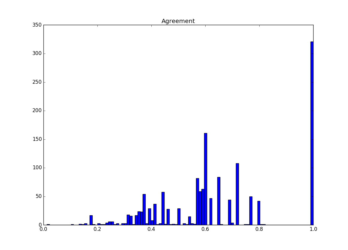
Note that a significant amount of our examples have an agreement of 1. This indicates a one-hot vector label, where one class gets 100% of the vote and all other classes are 0. There is another prominent section around .6. A couple common label distributions have values near here. A 50/50 label split has an agreement of ~0.57 and a 66/33 label split has an agreement of ~.60. So it makes sense for their to be a higher value in that area
Next, a histogram showing how the difference between the top 2 labels in each example in the test set:
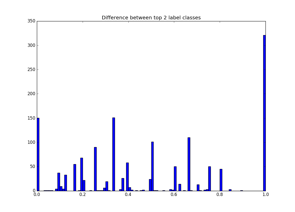
The amount of examples at 1 in this graph is identical to the number of examples that are 1 in the previous graph. This makes sense because if the difference between the top class in a label and the next best class is 1 then the distribution is a one-hot vector, which has an agreement of 1. There are a couple other noticeable columns in this graph. First 0 has quite a few values and it represents all of the sources that have top classes that are tied, examples of this are 50/50, 33/33/33, 25/25/25/25. The other large column is around .33 which can commonly be 66/33 .
Model Results
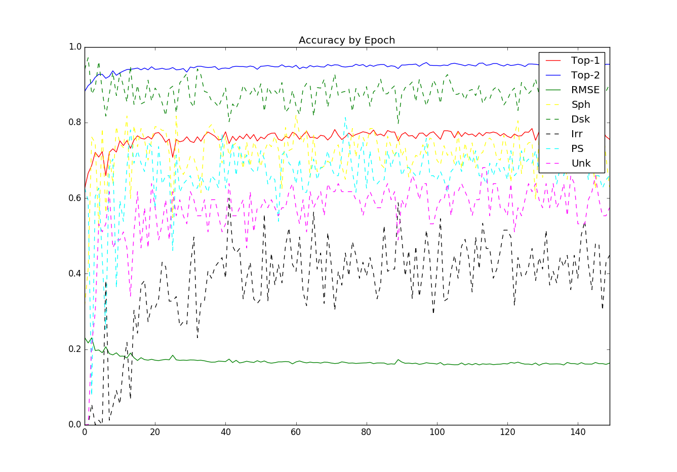
There is an interesting behavior seen here. The top-1 and top-2 accuracy stay fairly stable with what appears to a be a slight positive slope after epoch ~20. However the per class accuracy has a huge amount of variance over time.
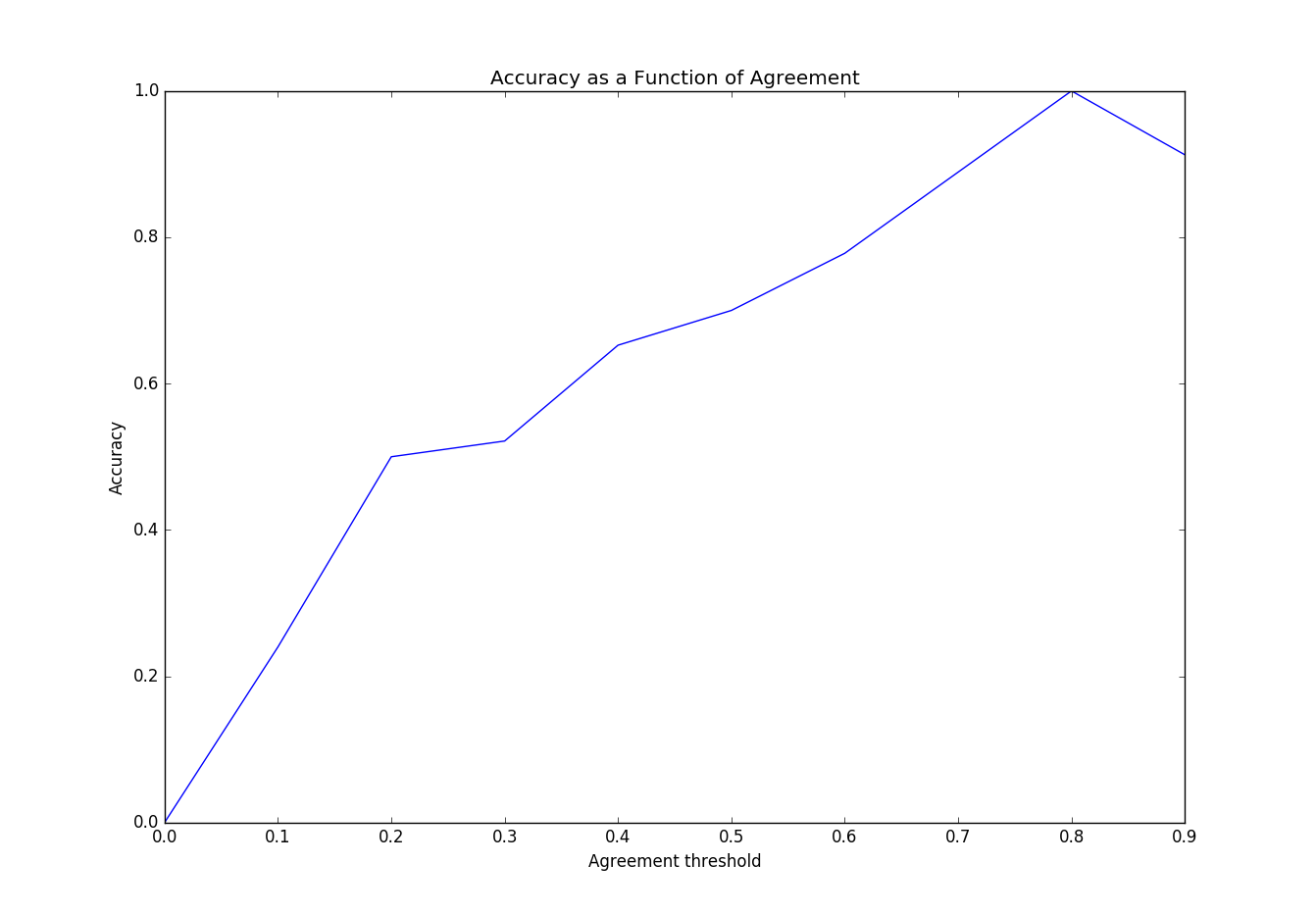
Here we see that the models accuracy as function of the agreement in the test set. The model’s accuracy improves as agreement on the class improves. This makes sense, but agreement favors classes with a strong single class classification. So this doesn’t realistically represent our success with bi-class examples.
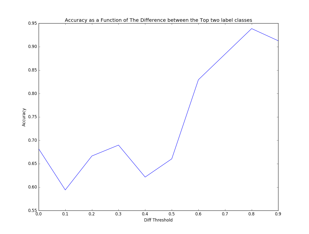
This graph is slightly more interesting and tells us more about how were doing with multi-class labels. But doesn’t tell us how we are doing on examples that have three or more label classes 33/33/33 or 25/25/25/25.
Based on this information I think its important to review the test set misclassification and to examine exactly how wrong we are. It may also be necessary to develop a new metric that can better tell how well a particular model is doing.